📈 Trend Charts – Line & Area Charts
Last Updated: 22 Sept 2025
Trend Charts show how data changes over time.
They are used to track progress, patterns, or trends.
✏ When to Use Trend Charts?
- Data is time-based (days, months, years).
- You want to show rise or fall over time.
- Compare trends of two or more groups.
🎨 Color & Style Tips
- Use different colors for different lines.
- Prefer soft, contrasting colors for readability.
- Use markers (
o,s,^) to highlight data points. - Avoid too many lines in one chart (confusing).
Do's & Don'ts
✅ Do
- Label x-axis (time) and y-axis (value).
- Add legend when comparing multiple lines.
- Use gridlines for better reading.
❌ Don’t
- Don’t skip axis or title.
- Don’t use 3D charts (makes trends hard to read).
- Don’t overcrowd chart with too many data points.
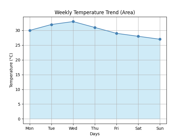
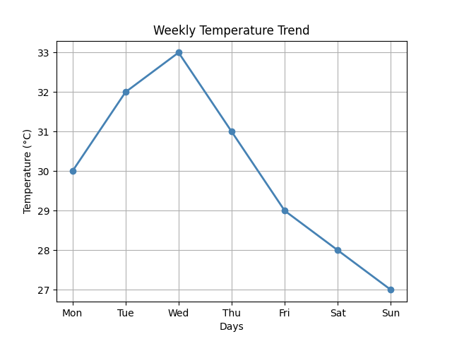
1. Line Chart
Let us consider the following data:

days = ["Mon","Tue","Wed","Thu","Fri","Sat","Sun"]
temperature = [30, 32, 33, 31, 29, 28, 27]

You want to create a line chart to track the temperature over the week.
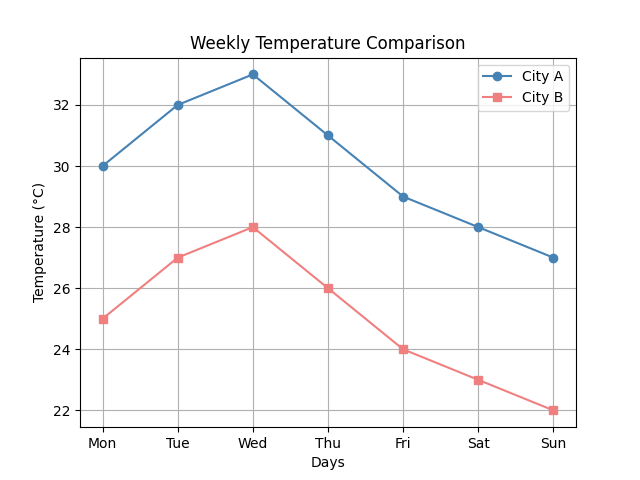
2. Multi-Line Chart
Let us consider the following data:

city_a = [30, 32, 33, 31, 29, 28, 27]
city_b = [25, 27, 28, 26, 24, 23, 22]

You want to create a multi-line chart to compare the temperature of two cities over the week.
3. Area Chart