🥧 Proportion Charts – Pie, Donut & Treemap
Last Updated: 23 Sept 2025
Proportion Charts are used to show how a total is divided into parts.
- Pie Chart → classic circle showing percentages
- Donut Chart → Pie Chart with a hole (aesthetic + space for labels)
- Treemap → rectangle-based chart showing hierarchy and proportion
✏ When to Use Proportion Charts?
- Data represents parts of a total (percentages, market share, votes).
- Best for few categories (5–7 max).
- Avoid for too many small slices — it becomes cluttered.
🎨 Color & Style Tips
- Use contrasting colors for each part.
- Avoid too many slices — group small categories as “Others”.
- Use consistent color palette across charts.
- Highlight important parts with a standout color.
Dos & Don’ts
✅ Do
- Add labels or percentages.
- Keep slices distinct and readable.
- Use legend if needed.
❌ Don’t
- Don’t use more than 7 slices.
- Don’t use 3D pie charts (distorts perception).
- Don’t ignore small slices — group as “Others”.
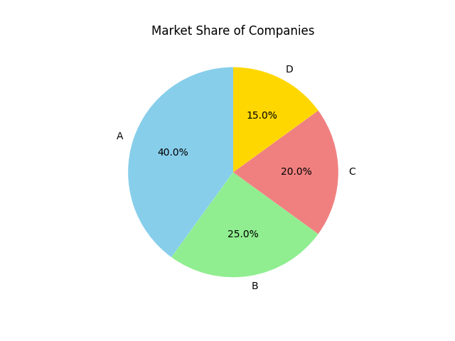
1. Pie Chart
Let us consider the following data:

companies = ["A", "B", "C", "D"]
market_share = [40, 25, 20, 15]

You want to create a pie chart to show the market share of different companies.
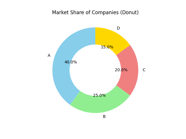
3. Donut Chart
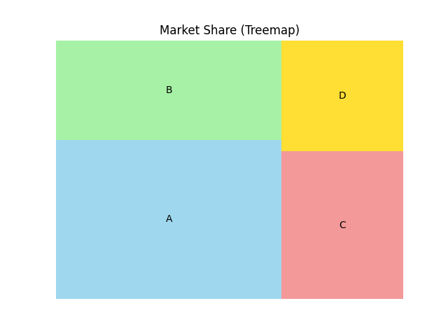
4. Treemap
Let us consider the following data:

sizes = [40, 25, 20, 15]
labels = ["A", "B", "C", "D"]

You want to create a treemap to show the market share of different companies.