🔤 Text / Frequency Charts – Word Cloud & Word Frequency Bar
Last Updated: 24 Sept 2025
These charts are used when data is text-based (like sentences, documents, reviews).
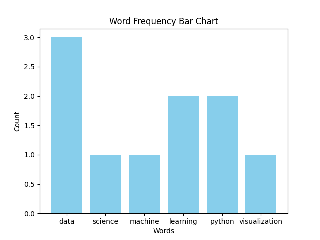
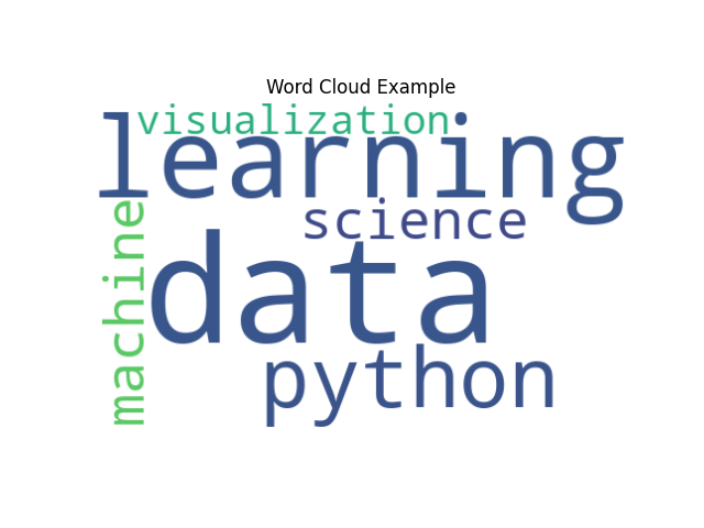
- Word Cloud → shows most frequent words using font size.
- Word Frequency Bar Chart → shows word counts using bars.
✏ When to Use?
- For text analysis (tweets, reviews, news articles).
- To find most common words quickly.
- As a visual summary in reports.
🎨 Color & Style Tips
- Use contrasting colors for readability.
- Avoid too many stopwords ("the", "is", "and") — remove them.
- Keep bar charts sorted (highest frequency first).
- Word Clouds should not be overcrowded (50–100 words max).
Dos & Don’ts
✅ Do
- Preprocess text (remove stopwords, punctuation).
- Highlight important keywords.
- Use consistent color palettes.
❌ Don’t
- Don’t use Word Cloud for exact comparisons (bar chart is better).
- Don’t overcrowd with too many words.
- Don’t forget labels in bar charts.
1. Word Cloud
Let us consider the following data:

text = "data science machine learning python data visualization data python learning"

You want to create a word cloud to show the most frequent words.
2. Word Frequency Bar Chart