🌍 Geographical / Map Charts
Last Updated: 22 Sept 2025
Geographical charts show data across locations.
- Choropleth Map → color intensity by value (e.g., population, cases)
- Symbol/Marker Map → points/markers indicate values at locations
- Heat Map (Geo) → density of events across areas
✏ When to Use Geographical Charts?
- Data has location info (countries, states, cities, coordinates).
- To spot patterns across regions.
- Useful for population, sales, or event data.
🎨 Color & Style Tips
- Use gradients to show intensity (light → dark).
- Use contrasting markers for different categories.
- Keep map simple — too many layers confuse.
Dos & Don’ts
✅ Do
- Include legend and color scale.
- Label key regions if needed.
- Use consistent projection for maps.
❌ Don’t
- Don’t use too many colors (hard to interpret).
- Don’t ignore outliers — highlight if important.
- Don’t clutter with unnecessary details.
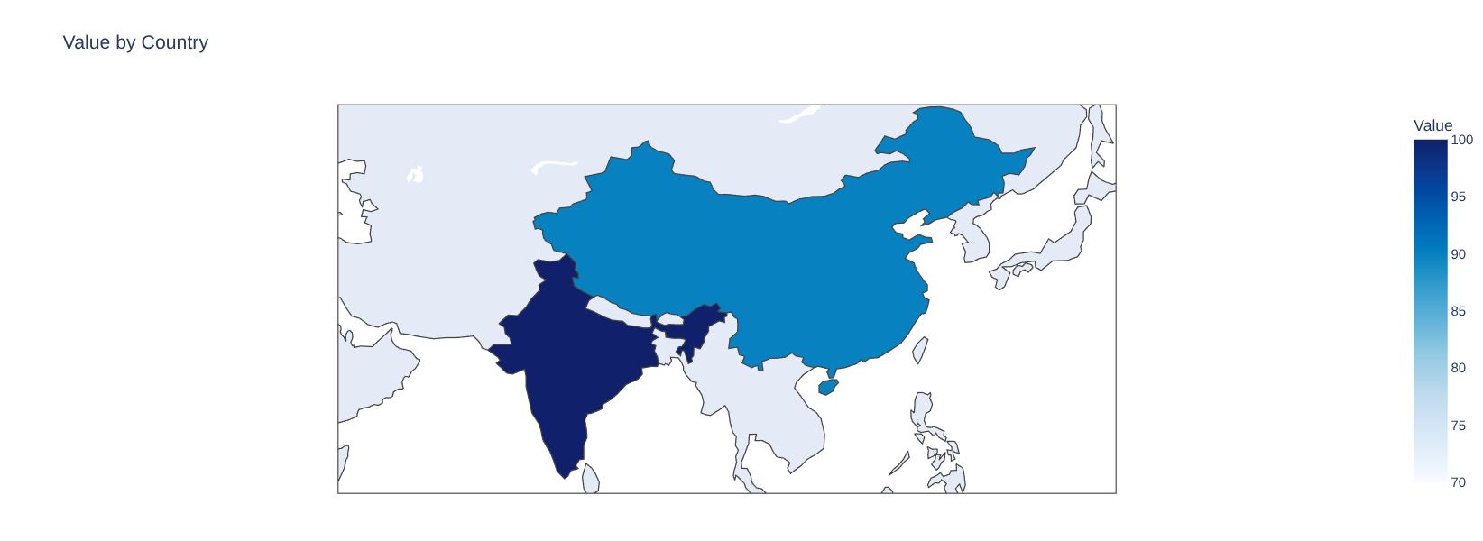
1. Choropleth Map (A map of a region with color intensity)
Let us consider the following data:

"Country": ["India","USA","China","Brazil"],
"Value": [100, 80, 90, 70]

You want to create a choropleth map to show the market share of different countries.
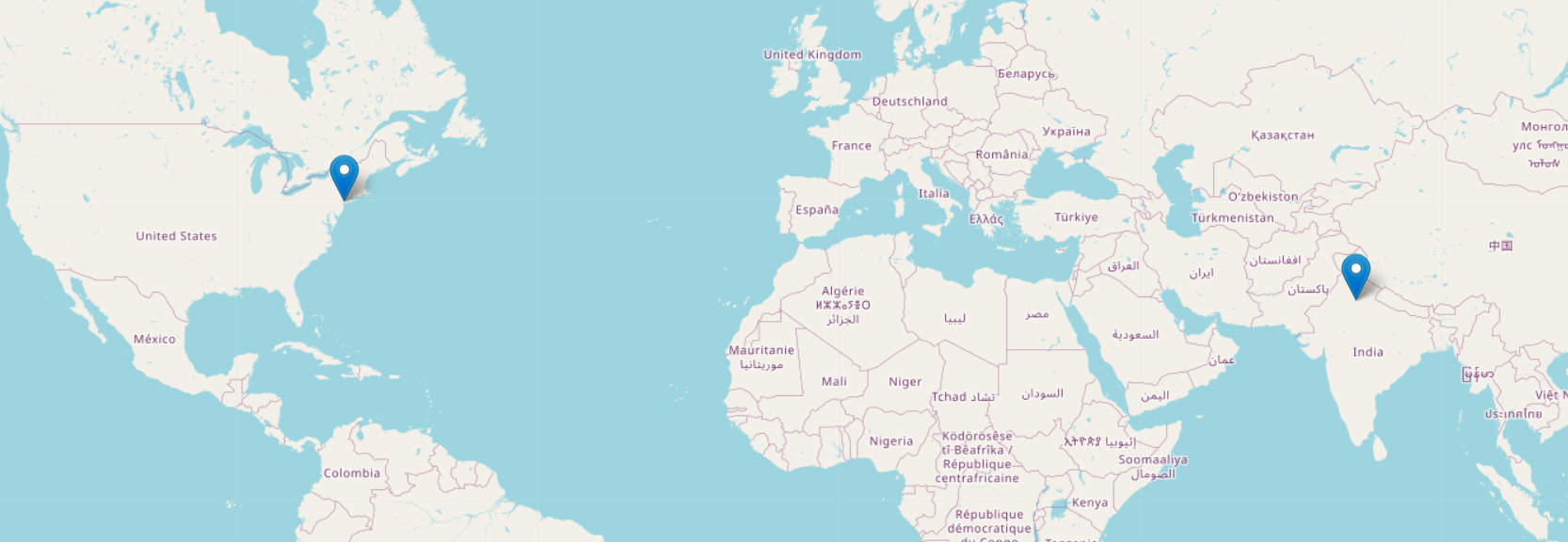
2. Symbol/Marker Map
Let us consider the following data:

Country = ["India","USA"],
longitude_latitude = [[28.7041, 77.1025], [37.0902, -95.7129]]

You want to create a map to show the locations of different countries.
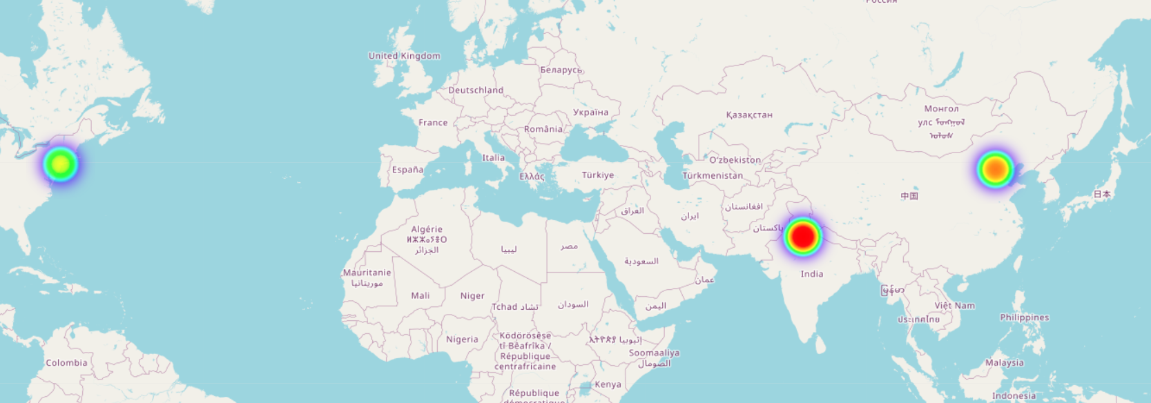
3. Heat Map (Geo)
Let us consider the following data:

heat_data = [[28.6139,77.2090,100],[40.7128,-74.0060,80],[39.9042,116.4074,90]]

You want to create a heat map to show the density of events across a region.