🔹 Relationship Charts – Scatter & Bubble Charts
Last Updated: 23 Sept 2025
Relationship Charts show how two (or more) numeric variables are related.
- Scatter Chart → show correlation between 2 variables.
- Bubble Chart → scatter chart + size of points = extra dimension.
✏ When to Use Relationship Charts?
- When both variables are numeric.
- To check correlation or patterns.
- To spot outliers (points that don’t follow trend).
🎨 Color & Style Tips
- Use different colors for different groups.
- Use size in Bubble Chart to represent extra info.
- Soft colors and transparency (
alpha) improve readability.
Do & Don’t
✅ Do
- Label x-axis and y-axis.
- Use legend for groups.
- Add grid for better reading.
❌ Don’t
- Don’t overcrowd with too many points.
- Don’t ignore outliers — they are important insights.
- Don’t use confusing colors or sizes.
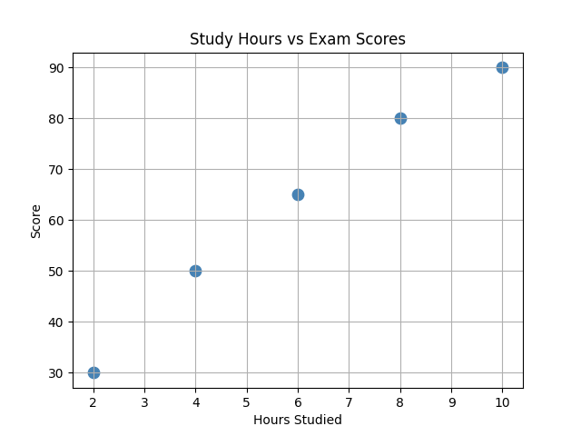
1. Scatter Chart
Let us consider the following data:

hours = [2,4,6,8,10]
scores = [30,50,65,80,90]

You want to create a scatter chart to show the relationship between study hours and exam scores.
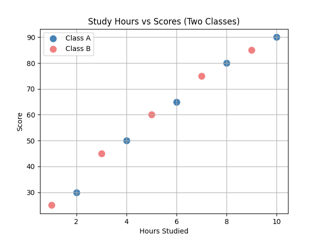
2. Colored Scatter Chart (Multiple Groups)
Let us consider the following data:

hours_a = [2,4,6,8,10]
scores_a = [30,50,65,80,90]

hours_b = [1,3,5,7,9]
scores_b = [25,45,60,75,85]

You want to create a colored scatter chart to show the relationship between study hours and exam scores for two groups.
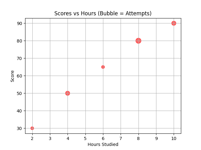
3. Bubble Chart