📊 Comparison Charts – Bar Charts
Last Updated: 22 Sept 2025
Comparison Charts are used to compare categories or groups.
The most common type is the Bar Chart.
✏ When to Use Comparison Charts?
- Data is categorical (fruits, products, countries).
- You want to compare values of different groups.
- Not for trends over time (use Line Charts for trends).
🎨 Color Rules & Tips
- One color per category is simple and readable.
- Use contrasting colors when comparing multiple groups.
- Avoid very bright/neon colors; prefer soft, distinguishable tones.
- Use a consistent color scheme for multiple charts in a report.
- Highlight important data with a standout color.
Do's & Don'ts
✅ Do
- Add axis labels and titles.
- Use legends if multiple groups are compared.
- Keep bar widths consistent.
- Sort categories logically (ascending, descending, or meaningful order).
❌ Don’t
- Don’t use too many colors (confuses the reader).
- Don’t truncate bars or axes (misleading visualization).
- Don’t use 3D bars unnecessarily (hard to interpret).
- Don’t overcrowd categories — keep it simple.
💡 Bar Chart Examples
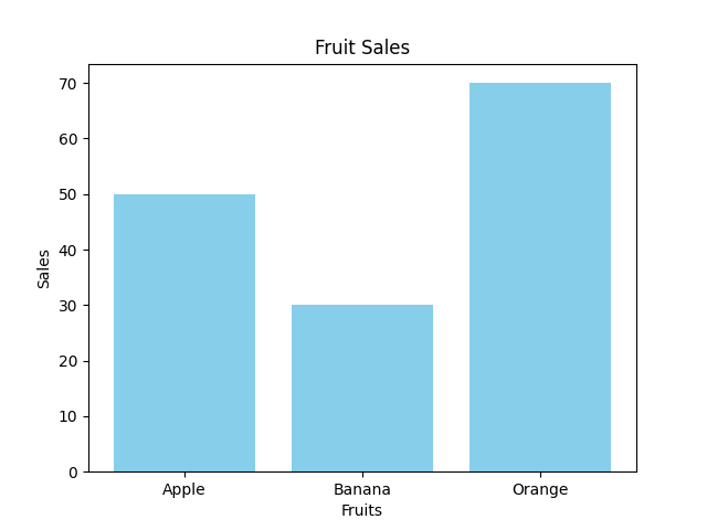
1.Vertical Bar Chart
Let us consider the following data:

fruits = ["Apple", "Banana", "Orange"]
sales = [50, 30, 70]

You want to create a bar chart to compare the sales of different fruits.
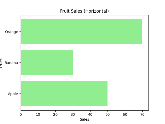
2.Horizontal Bar Chart
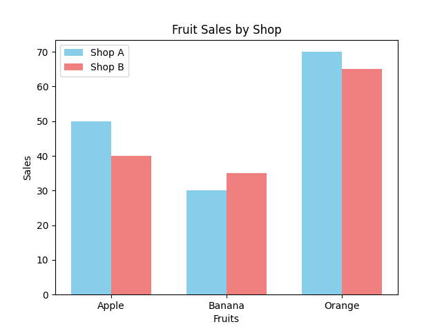
3.Grouped Bar Chart
Let us consider the following data:

fruits = ["Apple", "Banana", "Orange"]
shop_a = [50, 30, 70]
shop_b = [40, 35, 65]

You want to create a grouped bar chart to compare the sales of different fruits between two shops.
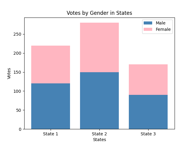
4.Stacked Bar Chart
Let us consider the following data:

states = ["State 1", "State 2", "State 3"]
male_votes = [120, 150, 90]
female_votes = [100, 130, 80]

You want to create a stacked bar chart to compare the votes of males and females in different states.